Conditional formatting to a line chart in Power BI can enhance data visualization by highlighting trends and changes. While Power BI does not support direct conditional formatting for line charts, you can achieve similar effects using a workaround (creating a bar chart with conditional formatting and then changing it to a line chart) . This guide will show you how to use a bar chart to set up conditional formatting and then convert it to a line chart.
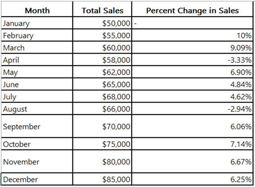
Sample Data:
How to create a conditional format line chart in Power BI
Step 1: Load the data into Power BI Desktop
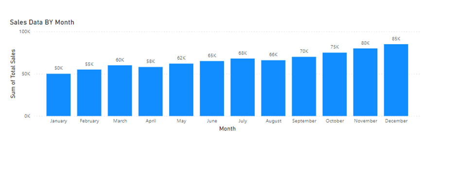
Step 2: Create the Bar chart of Sales data
If you directly create a line chart in Power BI, there is no conditional formatting option available, so you need to create a bar chart first.
Create Bar Chart:
Step 3: Create the custom column using DAX
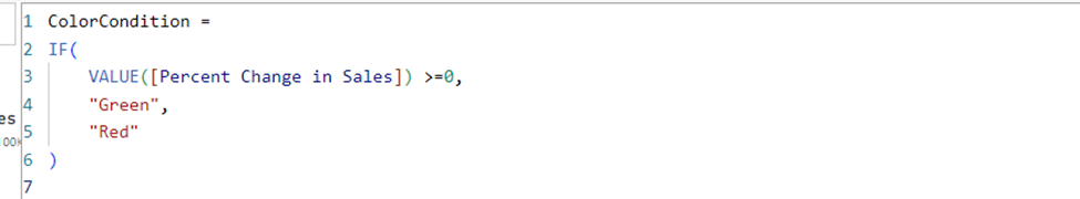
If there are positive changes in sales, then the color should be green; otherwise, it should be red.
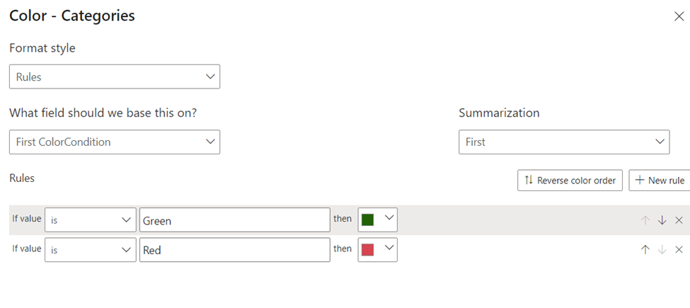
Step 4: Go to the column and set the color condition.
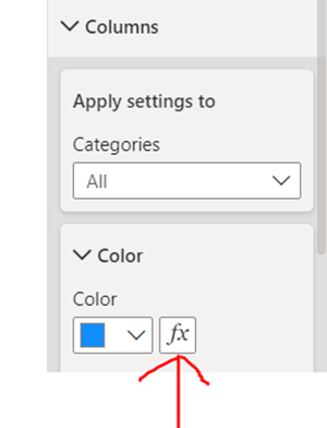
Set the rule

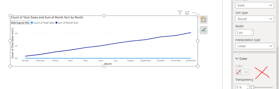
Step 5: Change the bar chart into a line chart
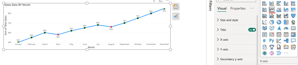
By following these steps, you can effectively apply conditional formatting to a line chart in Power BI, making it easier to visualize positive and negative trends in your data. This workaround enhances the interpretability and visual appeal of your reports