Data literacy remains a significant challenge for organizations, but there is a lot of space for improvement. Power BI and similar technologies can contribute to addressing this issue, but they are not the sole solution. It is crucial not to overlook the importance of a well-thought-out data strategy. Treating your organization’s data without proper planning is akin to undervaluing a valuable asset. To truly make progress, it requires a commitment to cultural change within the organization. Developing a strong data culture enables widespread empowerment and adoption throughout the organization.
Better data understanding and presentation offer significant advantages for organizations.
Data understanding enables more informed decision-making by extracting valuable insights and making data-driven decisions. This leads to accurate problem-solving, trend identification, and growth opportunities.
Effective data presentation enhances communication and collaboration. Clear visualizations help stakeholders comprehend complex information, fostering better collaboration across teams and departments.
It facilitates impactful storytelling. Compelling visualizations convey narratives, highlight patterns, and engage audiences, enabling persuasive presentations and influencing decision-makers.
Improved data understanding and presentation boost overall data literacy. Equipping employees with data skills empowers them to engage with data, ask meaningful questions, and contribute to data-driven initiatives. This fosters a culture of continuous learning and growth.
In Conclusion, better data understanding and presentation drive informed decision-making, improved communication, transparency, storytelling, and data literacy. These advantages propel organizational success, innovation, and competitive advantage in today’s data-driven landscape.
Core principles of data visualization
The core principles of data visualization are a set of guidelines and best practices that help in effectively communicating information through visual representations of data. These principles aim to enhance the understanding, interpretation, and impact of the data being presented. Here are some key core principles of data visualization:
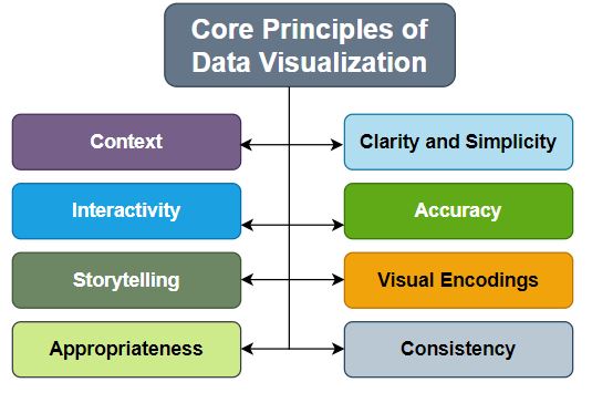
Clarity and Simplicity:
Data visualizations should be clear and simple, presenting information in a concise and easily understandable manner. Avoid clutter and unnecessary complexity that may confuse or overwhelm the viewer.
Accuracy:
Ensure that the visual representation accurately represents the underlying data. Avoid distorting or misrepresenting the data, as it can lead to misinformation and misinterpretation.
Context:
Provide appropriate context to aid interpretation. Use labels, titles, and annotations to explain the data and its significance. Consider providing comparisons, benchmarks, or historical trends to give a broader understanding of the data.
Use of Visual Encodings:
Utilize appropriate visual encodings, such as position, length, angle, color, size, and shape, to represent different data attributes effectively. Choose encodings that align with the nature of the data being presented and consider the perceptual abilities of the audience.
Consistency:
Maintain consistency in the use of visual elements, such as colors, fonts, and styles, throughout the visualization. Consistency helps in creating a cohesive and harmonious visual presentation.
Interactivity:
Interactive elements, such as tooltips, filters, and interactive controls, can enhance the user experience and enable exploration of the data from different perspectives. Interactivity allows users to engage with the visualization and discover insights relevant to their specific interests.
Storytelling: Use data visualization as a storytelling tool to convey a narrative or message. Arrange the visual elements in a logical sequence or flow that guides the viewer through the story and facilitates understanding.
Appropriateness: Choose the suitable type of visualization based on the data and the intended goals. Different visualization techniques, such as bar charts, line charts, scatter plots, maps, and information graphics, have different strengths and are suitable for different types of data.
Common Mistakes in Dashboard Visualization
Dashboard visualization is an essential tool for presenting complex data in a clear and concise manner, enabling users to gain insights and make informed decisions. However, there are some common mistakes that can make dashboards confusing or misleading.
By avoiding common Mistakes, we can create dashboards that effectively communicate data and empower users to make informed decisions. Dashboard designers and developers need to be aware of the following common mistakes to ensure effective design.
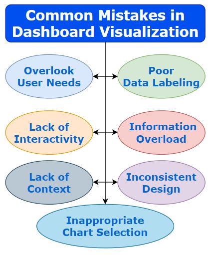
Poor Data Labeling
Inadequate or ambiguous labeling of data points, axes, or legends can lead to confusion and misinterpretation of the information. Clear and concise labeling is crucial to ensure users understand what they are seeing.
Information Overload
Including too much information or too many visual elements on a single dashboard can overwhelm users and make it difficult for them to grasp the key insights.
Lack of Context
Failing to provide sufficient context or explanations alongside the visualizations can leave users wondering about the meaning and significance of the displayed data Including clear titles, captions, or annotations can help provide context and guide interpretation.
Inappropriate Chart Selection
Choosing the wrong chart type for the data being presented can misrepresent the information or make it harder to understand.
It’s essential to select the appropriate chart type that best represents the data and supports the intended analysis or message.
Ignoring User Needs
Designing dashboards without considering the needs and perspectives of the intended users can result in irrelevant or confusing visualizations. It’s crucial to understand the users’ goals, questions, and preferences to create dashboards that effectively address their needs.
Inconsistent Design
Inconsistencies in color choices, fonts, or visual styles across different visualizations within a dashboard can make it visually chaotic and difficult to follow.
Maintaining a consistent design aesthetic improves readability and user experience.
Lack of Interactivity
Failing to incorporate interactive elements in the dashboard, such as filters or drill-down capabilities, can limit users’ ability to explore the data further and gain deeper insights. Interactivity can enhance user engagement and enable more in-depth analysis.
Advanced Analytics In Power BI With R And Python: Ingesting, Transforming, Visualizing
Good article worth to study.keep it up .😊😊