Power BI is a powerful business intelligence tool that help the organizations to make data-driven decisions. One of the strengths of Power BI is its ability to integrate with R and Python, programming languages for data analysis and visualization. We can use R and Python in Power BI to ingest, transform, and visualize data.
Ingesting data
Power BI supports several ways of ingesting data into a report, including importing data from a file or connecting to a data source. R and Python can be used to ingest data into Power BI by connecting to a data source and retrieving data via an R or Python script.
For example, you can use R to connect to a database and retrieve data using the RODBC package. Once the data is retrieved, you can transform it using R and then pass the transformed data back to Power BI using the powerbiUtils package. Similarly, you can use Python to connect to a data source and retrieve data using a library like pyodbc. Once the data is retrieved, you can transform it using Python and then pass the transformed data back to Power BI using the PythonScriptWrapper package.
Transforming data
Once data is ingested into Power BI, R and Python can be used to transform the data in a variety of ways. For example, you can use R to clean and preprocess data, perform statistical analysis, and create visualizations using packages like tidyverse, dplyr, and ggplot2. Similarly, you can use Python to perform machine learning tasks, create custom visualizations using libraries like matplotlib and seaborn, and perform data wrangling tasks using libraries like pandas.
One way to use R or Python to transform data in Power BI is to create a custom visual. Custom visuals allow you to create visualizations using R or Python code, which can be embedded directly into a Power BI report. You can create custom visuals using the pbiviz command line tool and the plotly, ggplot2, or d3js packages in R, or the plotly, matplotlib, or seaborn libraries in Python.
Visualizing data
Finally, once data is ingested and transformed, R and Python can be used to create visualizations that can be embedded into a Power BI report. Power BI has a rich set of built-in visualizations, but sometimes you need to create custom visualizations to convey the information you need.
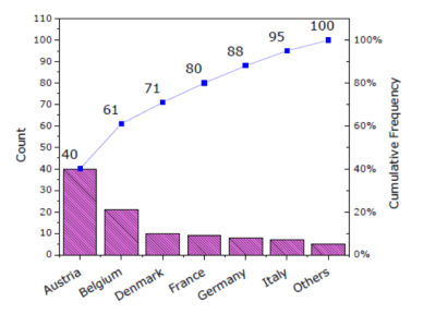
Using R or Python, you can create custom visualizations that can be embedded directly into a Power BI report. As mentioned earlier, custom visuals can be created using the pbiviz command line tool and R or Python libraries like ggplot2 or matplotlib. Once the visual is created, it can be embedded into a Power BI report just like any other visual.
R and Python programming language can help you unlock the full potential of your data in Power BI.