Data visualization is a powerful tool for making sense of complex data. By using various chart types, we can highlight trends, compare quantities, and uncover patterns. Here’s a quick guide to some of the most commonly used visualization methods:
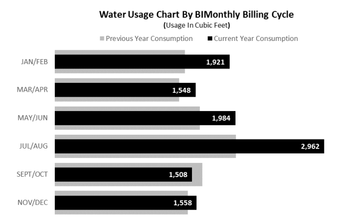
Bar Chart
Rectangular bars represent different categories, making it easy to compare quantities across multiple groups.
Line Chart
Ideal for showing trends over time, data points are connected by lines to highlight changes.
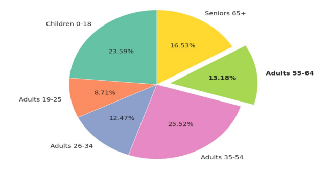
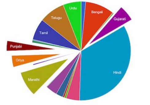
Pie Chart
This circular chart is divided into slices to illustrate proportions within a whole.
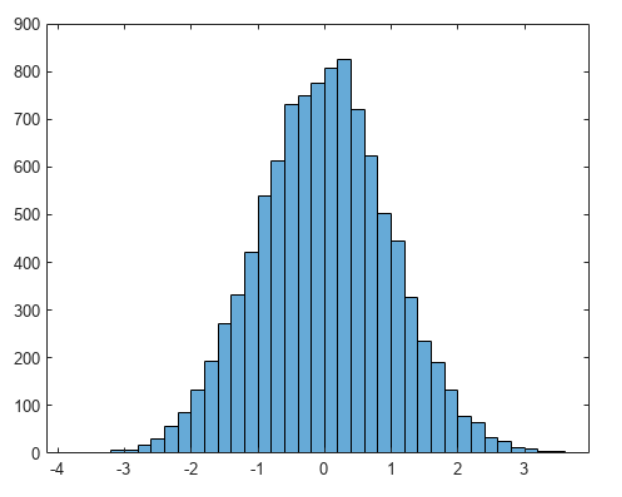
Histogram
Used to display the frequency distribution of data ranges with adjacent bars.
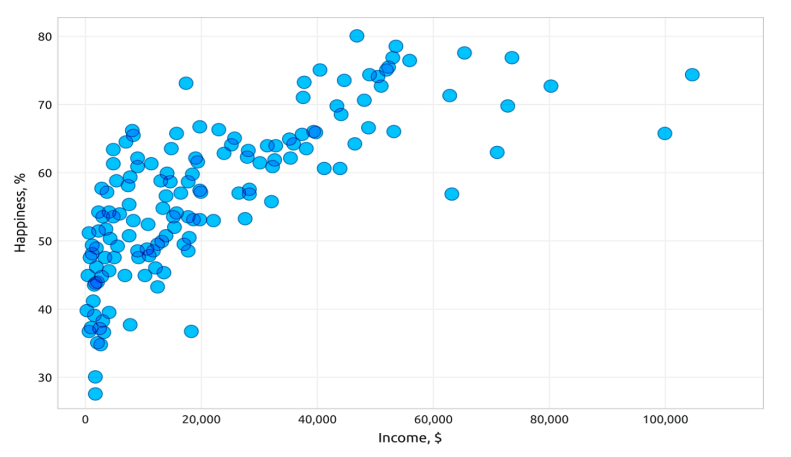
Scatter Plot
Shows relationships between two variables with individual data points, useful for identifying correlations.
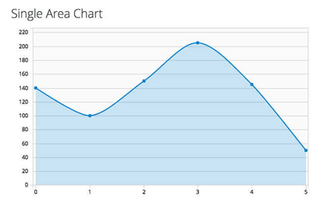
Area Chart
Similar to a line chart but with the area beneath the line filled, emphasizing magnitude changes over time.
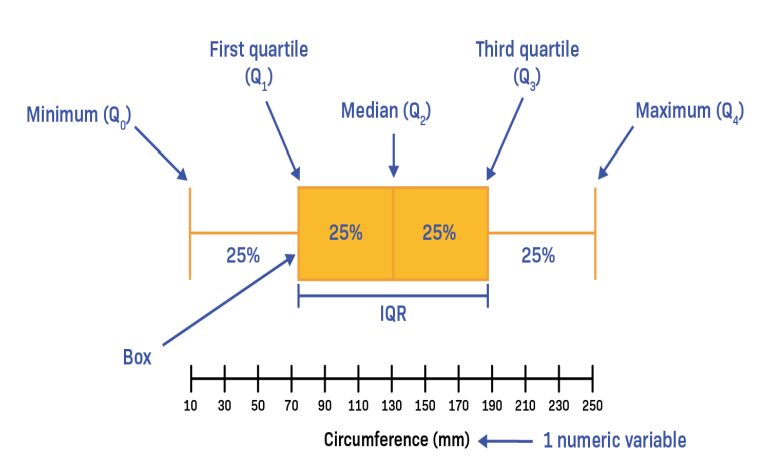
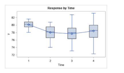
Box Plot
Displays data distribution based on a five-number summary (minimum, first quartile, median, third quartile, maximum).
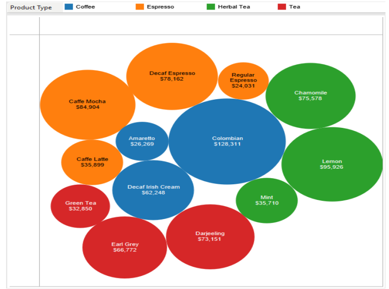
Bubble Chart
An enhanced scatter plot where the size of the bubbles represents an additional variable.
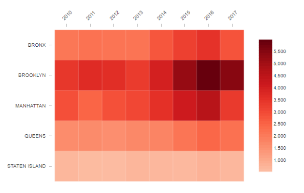
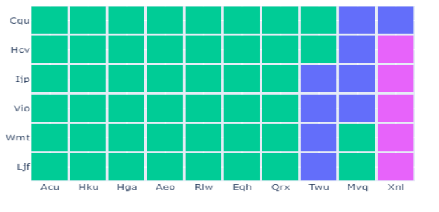
Heatmap
A color-coded matrix to visualize patterns and correlations within a dataset.
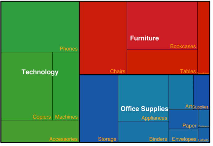
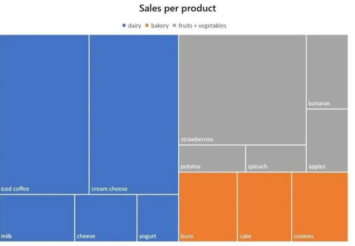
Tree Map
Uses nested rectangles to display hierarchical data, with size representing value.
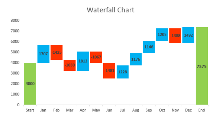
Waterfall Chart
Sequential cumulative values often used in financial data to show changes over time.
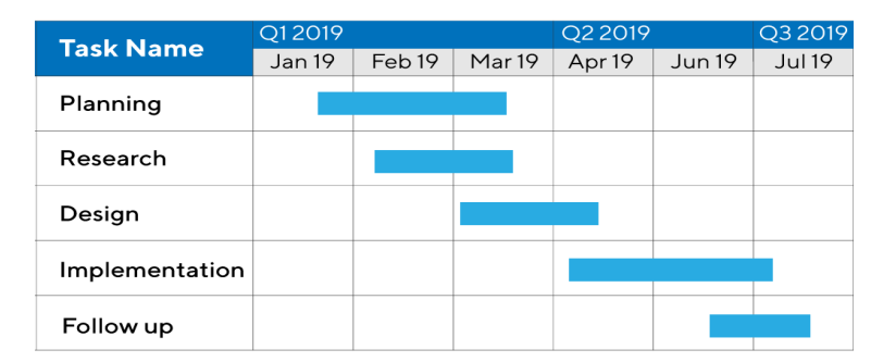
Gantt Chart
A bar chart that illustrates project schedules, timelines, and task durations.
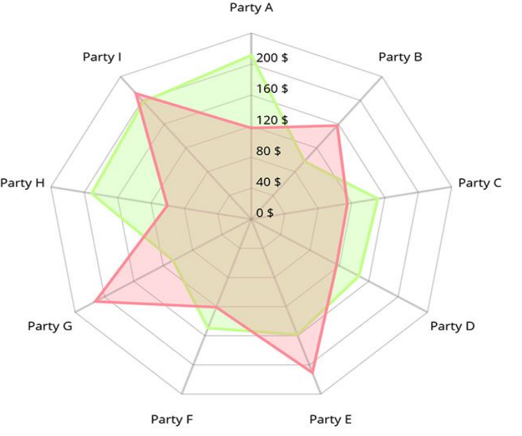
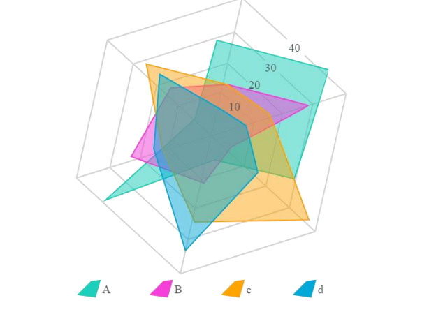
Radar Chart
Compares multiple attributes in a radial layout, useful for performance analysis.
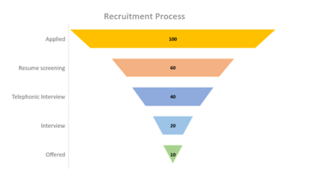
Funnel Chart
Visualizes stages in a process, highlighting potential drop-offs.
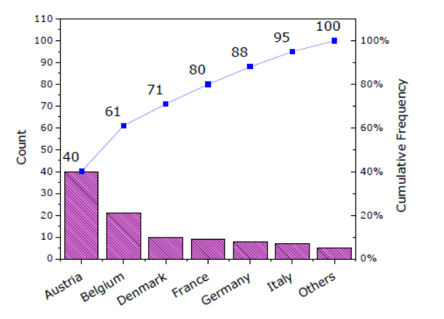
Pareto Chart
Combines bars and a line chart to identify the most important factors in a dataset.
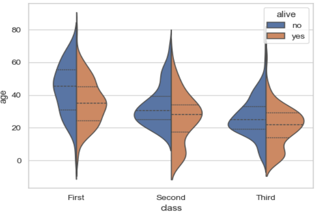
Violin Plot:
Merges a box plot with a density plot to show data distribution.
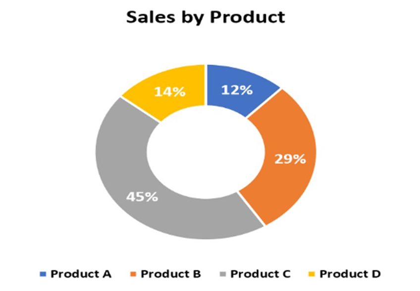
Doughnut Chart
A pie chart with a hole in the middle, often used for additional labeling.
Spider Chart
Another term for a radar chart, used interchangeably.
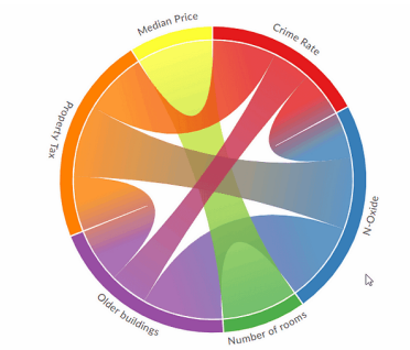
Chord Diagram
Displays relationships between data points in a circular layout.
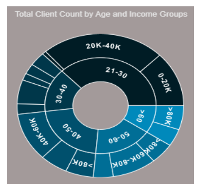
Sunburst Chart
Represents hierarchical data through concentric rings, expanding outwards.
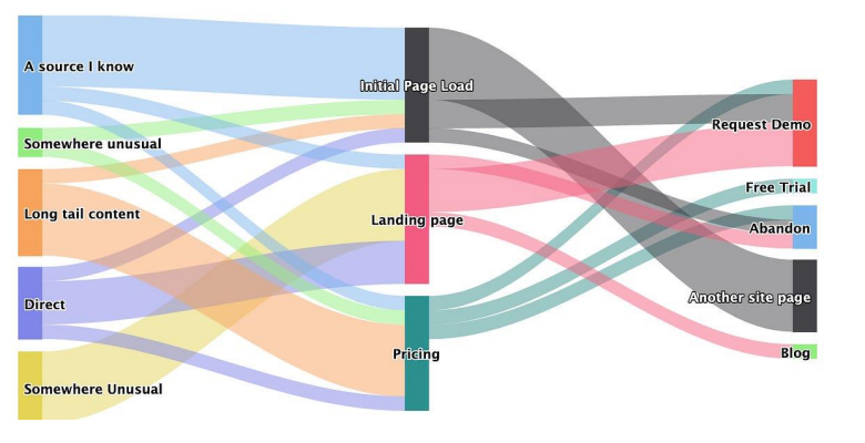
Sankey Diagram
Visualizes flow and quantities between stages, showing movement and relationships.
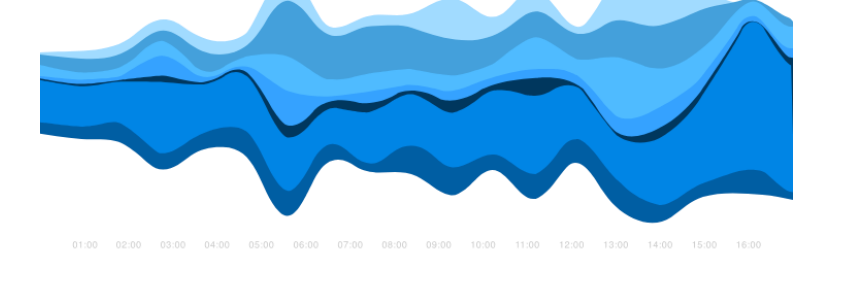
Streamgraph
An organic, flowing shape for displaying time-series data across multiple categories.
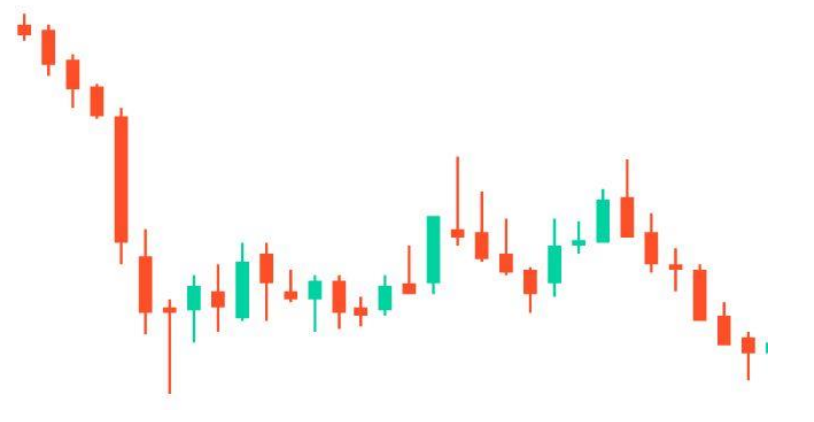
Candlestick Chart
Widely used in financial markets to depict price movements over time.
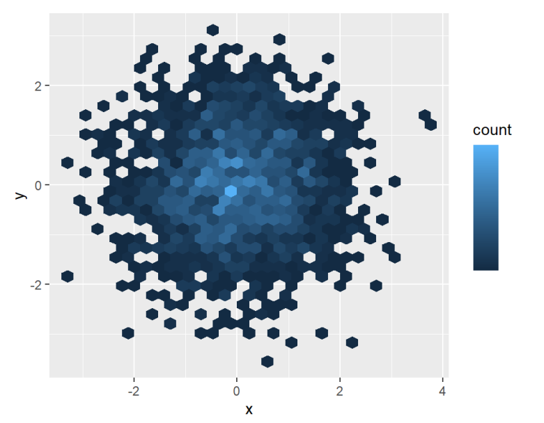
Hexbin Chart
Uses hexagonal bins to show the density of data points, offering a clear view of distribution.
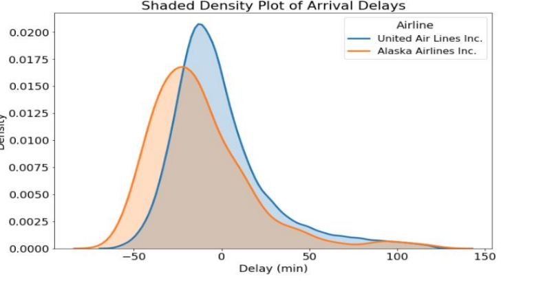
Density Plot
A smoothed version of a histogram, showing the distribution of data points.
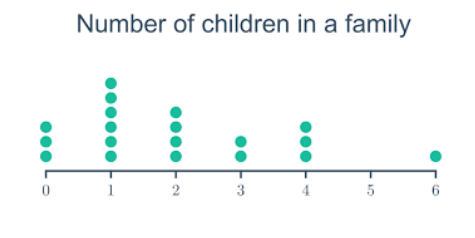
Dot Plot
Simple dots represent small datasets, useful for minimalistic data representation.
Bullet Chart
Compares performance against a target, often used in business dashboards.
Marimekko Chart
Displays categorical data along two axes, useful for market share analysis.
Polar Area Chart
Similar to a pie chart but with equal angles, ideal for cyclical data.
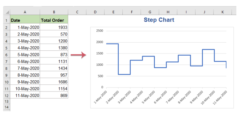
Step Chart:
A line chart with step-like connections, highlighting interval changes.
Error Bar Chart
Adds error bars to standard charts to indicate data variability and uncertainty.
Waffle Chart
Uses a grid of squares to represent percentages, making proportional data easy to grasp.
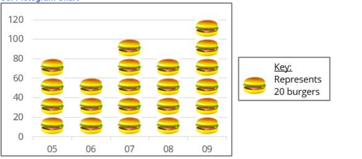
Pictogram Chart
Engages audiences by using icons to represent data points.
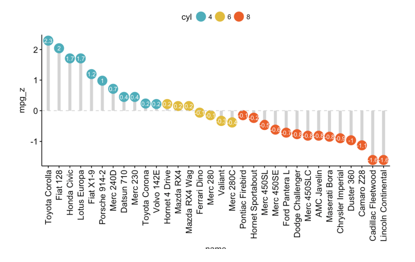
Lollipop Chart
Combines bars and dots, adding visual interest to categorical comparisons.
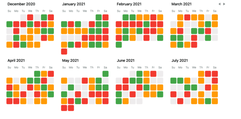
Calendar Heatmap
Displays data over a calendar, highlighting daily, weekly, or monthly patterns.
These visualization techniques are essential tools for data analysis, helping to transform raw data into actionable insights. Whether you’re presenting business metrics, scientific research, or everyday information, choosing the right chart type can make your data more compelling and understandable.
MCQ Practice Questions: Click here