Data and AI Career Paths Explained: Data Analyst to GenAI Engineer
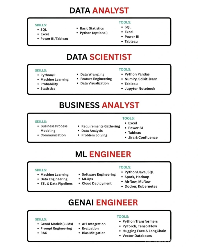
The data and artificial intelligence industry offers multiple career paths, each with its own responsibilities, skill sets, and tools. Roles such as Data Analyst, Data Scientist, Machine Learning Engineer, and GenAI Engineer are often confused, yet they serve very different purposes. This article explains the key differences between these roles to help you choose the […]
Data and AI Career Paths Explained: Data Analyst to GenAI Engineer Read More »